Litle King Font
1
Views
34
Downloads
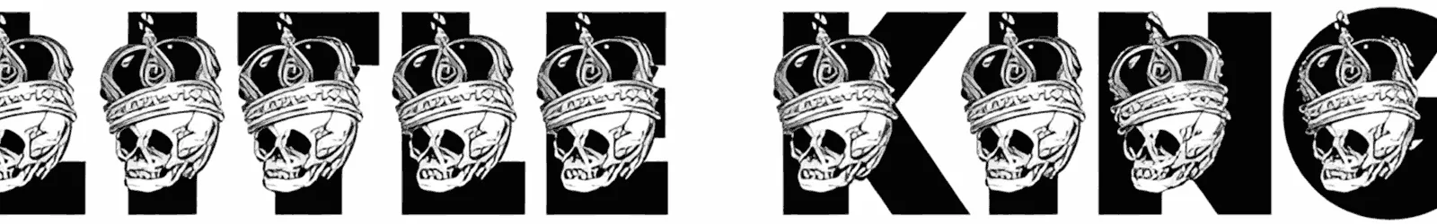
The skulls hanging from each letter in Litle King haven’t only detracted from its legibility but also significantly increased the creepy feeling. This is for creative designers who always want to be unique and avoid following repetitive trends.
That’s why the absence of small letters and numbers isn’t seen, and it will always have a special place in the category of horror fonts. Posters, ads, and titles designed with this font can progress and attract attention in a short time.
This font is partial and free for personal use only.
THREE overlapping fonts!
For further information, contact us. >
Commercial licenses and complete versions available at >>
visit
Related Mockups

Compagnon Font
by
in
Fonts

Bagnard Font
by
in
Fonts

Latitude Équateur
by
in
Fonts

VG5000 Font
by
in
Fonts

Terminal Grotesque
by
in
Fonts

Black Rusher Font
by
in
Fonts

Getrok Font
by
in
Fonts

Geol Font
by
in
Display Fonts

Garten House Font
by
in
Fonts

Kalemanja Font
by
in
Display Fonts

Distrampler Font
by
in
Fonts

Wocke Funky Font
by
in
Fonts

Bubble Street Font
by
in
Fonts

Bulgatry Font
by
in
Fonts

Fabulous Spring Sans Font
by
in
Fonts

Easternation Font
by
in
Handwritten Fonts

East Gravton Font
by
in
Fonts

Dishcek Font
by
in
Fonts

Child Font
by
in
Fonts

Candy Birthday Font
by
in
Fonts

Burba Font
by
in
Fonts

Books And Pens Font
by
in
Handwritten Fonts

Stand Alone Font
by
in
Fonts

Summary Notes Font
by
in
Handwritten Fonts